Posted: May 6, 2016 | Author: freyasharp1993 | Filed under: Contextualisation |
- Artemesia Gentileschi’s self portrait https://freyasharpblog.wordpress.com/2015/09/23/artemisia-gentileschi/
- Fiona Hall Wrong Way Time https://freyasharpblog.wordpress.com/2015/10/16/venice-fiona-hall/
- Sheela Na Gig symbolism https://freyasharpblog.wordpress.com/2015/12/02/sheela-na-gig/
- Alice Neel’s nude self portrait https://freyasharpblog.wordpress.com/2015/12/08/alice-neel/
- Pygmalion themes https://freyasharpblog.wordpress.com/2016/02/22/pyg-na-gig/
Posted: May 6, 2016 | Author: freyasharp1993 | Filed under: Documentation, Uncategorized |
- summer sketchbook: I began making automatic expressive drawings based on emotions and female identity https://freyasharpblog.wordpress.com/2015/10/14/summer-sketchbook/
- Self portraiture: I made expressive self portraiture as evidence of my relationship with myself focusing on mark making and realism. https://freyasharpblog.wordpress.com/2015/10/21/self-portrait/
- Auras: I focussed my cathartic drawing down to meditations on certain subjects https://freyasharpblog.wordpress.com/2015/11/02/auras-2/
- Arranging the pieces together to maker larger pieces which communicated a wider picture. https://freyasharpblog.wordpress.com/2015/11/18/arrangements/
- self exposure self portrait: I expressed my own sexual and artistic agency through a A1 self portrait https://freyasharpblog.wordpress.com/2016/04/12/self-exposure-self-portrait/
Posted: May 6, 2016 | Author: freyasharp1993 | Filed under: Contextualisation, Subject |
Wolfgang Tillmans, German contemporary fine art photographer exhibits his work in a similar way to mine. He is interested in the foundations of photography and uses this means of exhibition as an exploration of its potential.
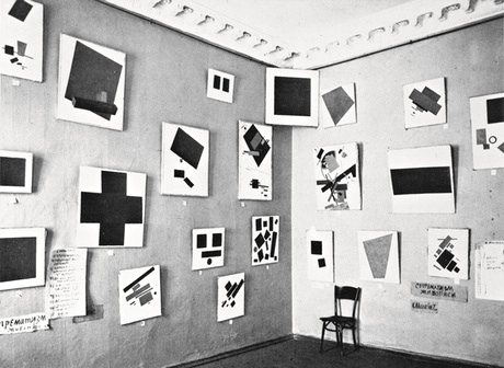
1915, Petrograd, Malevich introduced his non objective art in another similar exhibition method.
The Dullwich picture gallery in south London was inovatively designed by Sir John Soane and exhibits work illuminated by skylights and clever architecture. The pictures are not traditional in their arrangement and are close together. 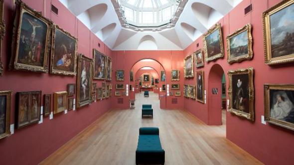
Posted: May 6, 2016 | Author: freyasharp1993 | Filed under: Documentation, Field, Subject |
I finally completed the composition.
Posted: May 5, 2016 | Author: freyasharp1993 | Filed under: Uncategorized |
I’m particularly interested in exploring the relationship between power and vulnerability which comes with self exposure as a female artist.
I express personal experiences and emotions through drawing and text; in particular self portraiture and automatic drawings done in oil pastel, as the material enables me to express emotion through every mark, physically pushing into the paper, enabling cathartic release.
Posted: May 4, 2016 | Author: freyasharp1993 | Filed under: Documentation, Subject |
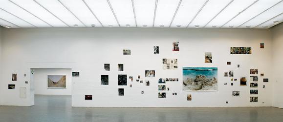
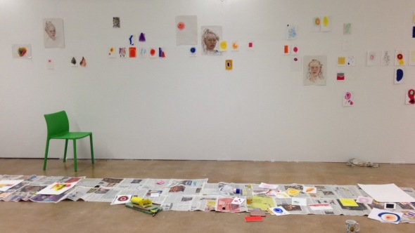
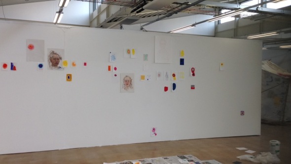
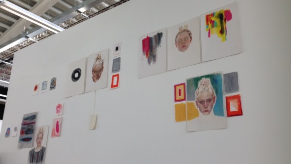
my space can be seen from across the void so I kept going across to see what the view was like from there and how the shapes and images related from that distance. It was helpful to step back and be able to see problems occurring. The work kept on moving and felt as though it might now work, I found that often there were pieces that I thought would definitely be included in the final cut that simply didn’t work with the composition and I removed them to find less was more. Very few of the pieces stayed in the same place on the wall once up.
I started from the centre of the wall and then decided where I wanted certain works to be on the left. I knew that the exhibition would be entered from left and right and seen from across the void so I had to make sure I kept aware of this in terms of knowing how it would be read from each of these positions.
Posted: May 4, 2016 | Author: freyasharp1993 | Filed under: Documentation, Subject |

I placed all of my potential exhibition works on the flood and edited them down for hours arranging them in chronological order and into relatable groups, editing all the time, when I had taken out as many as I thought I would I counted the remaining exhibitable works and there were over 100.
I began sticking the woks to the wall with masking tape so that I could move them around as intuition required.
Posted: April 29, 2016 | Author: freyasharp1993 | Filed under: Documentation, Subject |
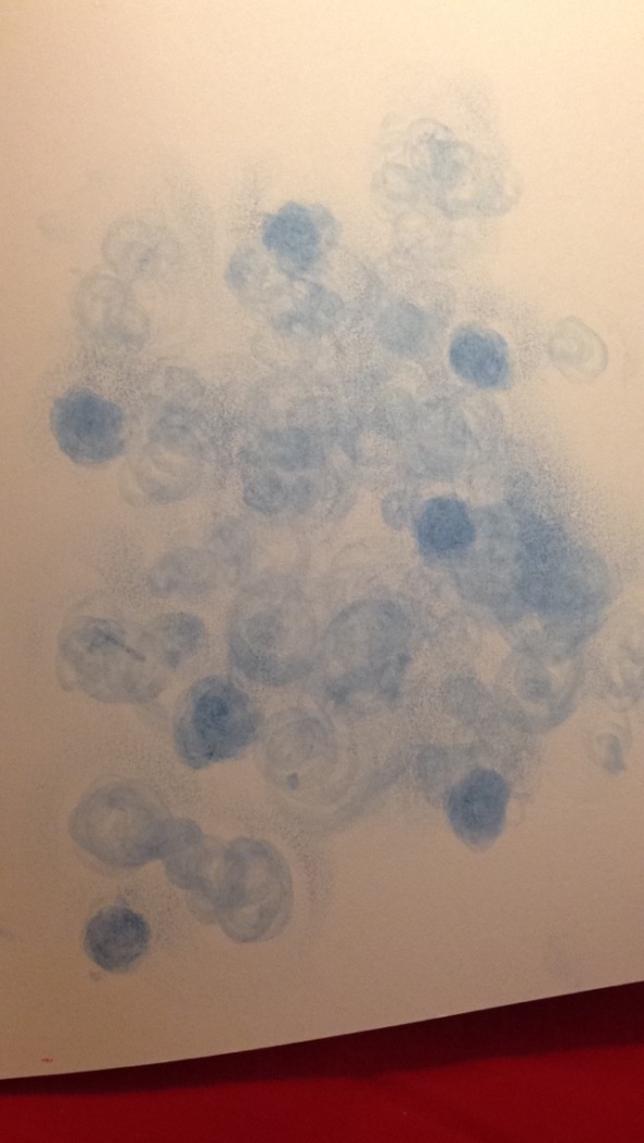
Having made an oil pastel drawing that included a thick area of dark blue I had a small ball of oil Pastel that had come off the blue pastel when drawing. I used this small ball and rolled it onto the page with my finger I let the work be meditative and organic. The marks made as a result were particularly unusual and expressive of the calm excitement i was experiencing in the moment.
Posted: April 19, 2016 | Author: freyasharp1993 | Filed under: Documentation, Field |
I intended on having a black wall for my exhibition to hopefully create a framing effect for the pictures as well as emphasise the careful arrangement of them on the wall, I was inspired by Fiona Hall’s wrong way time exhibition and thought the effect of a black wall would be to make the work more intimate. Turns out I was wrong as I hadn’t considered the rest of the conditions of the space, I know which space I am getting and it’s a 40 foot log wall in the middle of the gallery space it can also be seen from across the void and is a central space in the exhibition. The conditions that I can’t control fully are the openness, which is good, I can work with exposure, I have always imagined by work being displayed in an extremely exposed way and all of my exhibition ideas and trials have been aiming to find the balance between intimate and uncomfortably exposed. Also the lighting is bright and often natural light will be reflected on to the wall, the floor is concrete and the ceiling is industrial looking with bare lighting and fixtures and the roof is corrugated.
I hadn’t considered all these things to realise that a white wall would emphasise this exposure and could benefit my work hugely, so I tried out the black wall idea. It was a bad idea due to the lighting, I think to get the effect I had hoped for the setting should have dim lighting and an enclosed low ceiling. I tried out the pieces that I supposed might not work well against black and they showed the black wall up for what it was.
Posted: April 19, 2016 | Author: freyasharp1993 | Filed under: Documentation, Subject |
tantric drawing meditating on future with Bawo
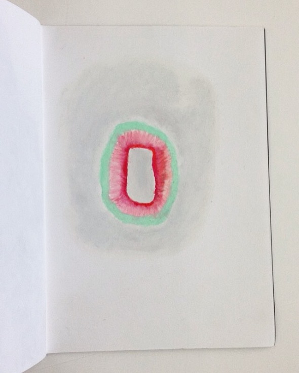
tantric drawing based on feelings about exhibition work
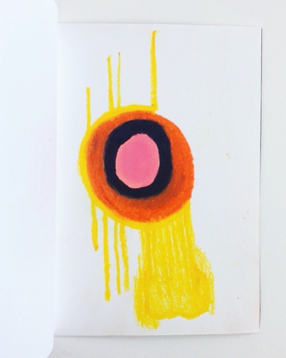
tantric drawing based on feelings about art school
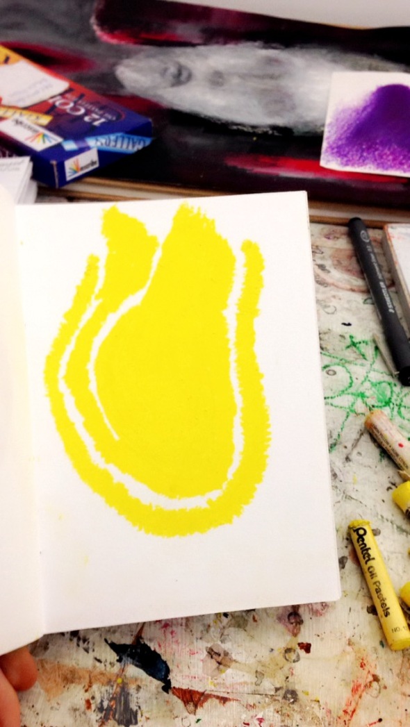
3 different yellow oil pastels were used to create differnt textures of the same colour ncapsulating eachother
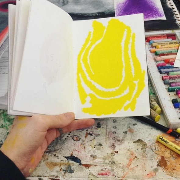
allthe yellows


